Objective: To develop an intuitive visual app interface for the Hartsfield-Jackson Atlanta International Airport that optimizes efficiency and reliability for users
Research
As I researched the Hartsfield-Jackson Atlanta International Airport, I identified two key factors for an effective app design...
The app needed to be clear, precise, and simple, enabling users to interact with it efficiently in a large and busy setting without adding unnecessary complexity.
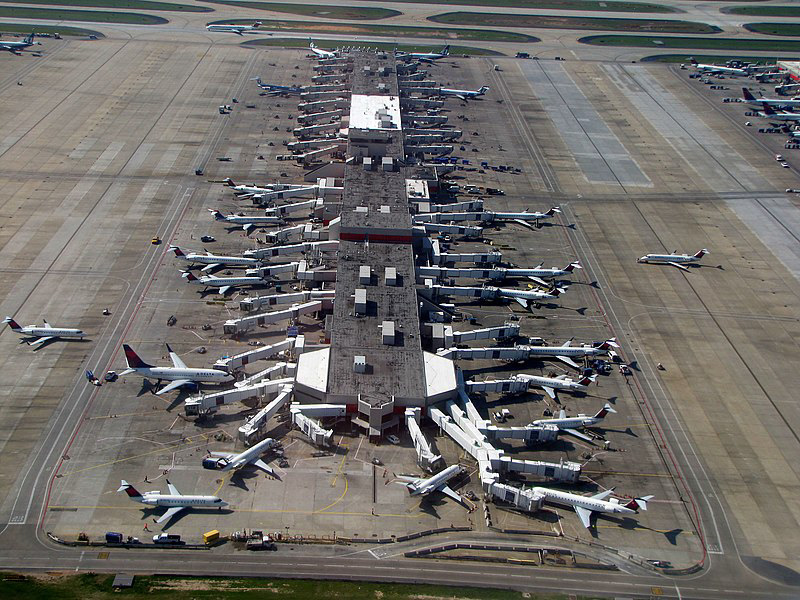
As of April 2023, Hartsfield-Jackson Atlanta International Airport was awarded "the world’s busiest airport in 2022." In addition, they continue to grow as "ATL served 93,699,630 passengers, a 23.8 percent increase over 2021’s total" (History of ATL).
The app needed to be accessible in multiple languages to ensure any user could interact with it.

Ideation
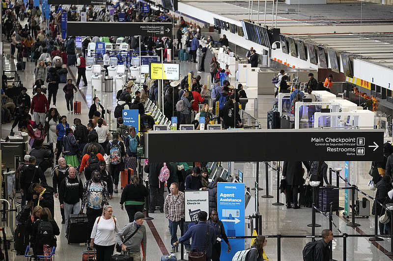
While designing the airport app interface, I prioritized creating clear "checkpoints" or key screens where users spend the most time, ensuring each screen presented essential information with a clear visual hierarchy to optimize user interaction.
Rough Ideation
Digital Iteration
First Iterations
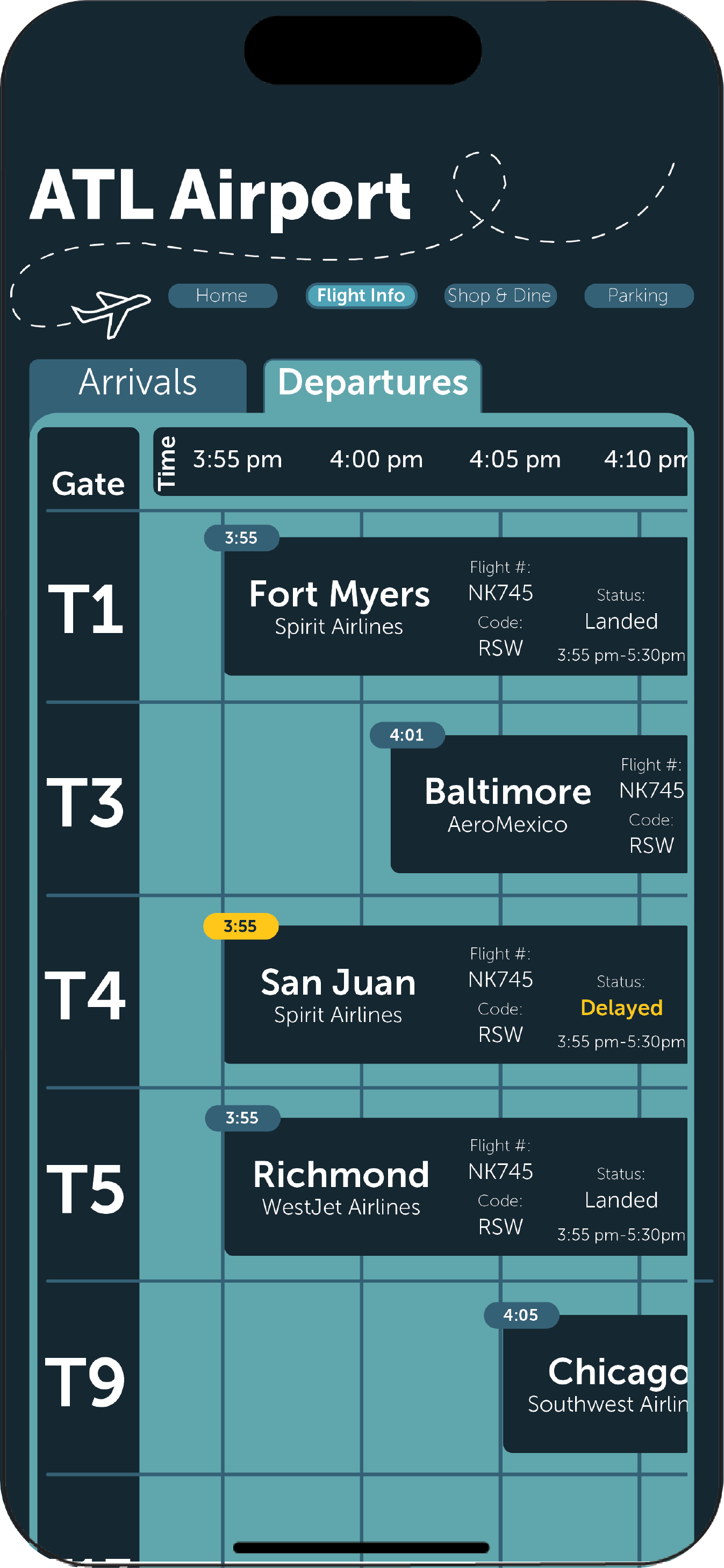
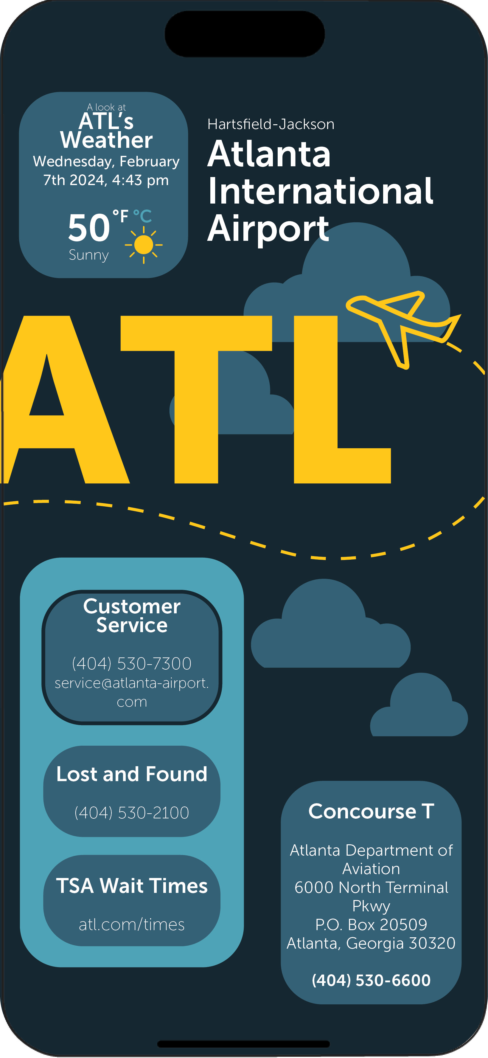
My initial designs had some challenges with clarity and organization, but they were valuable in guiding me to develop a more effective hierarchy for the airport information.
Second Iterations
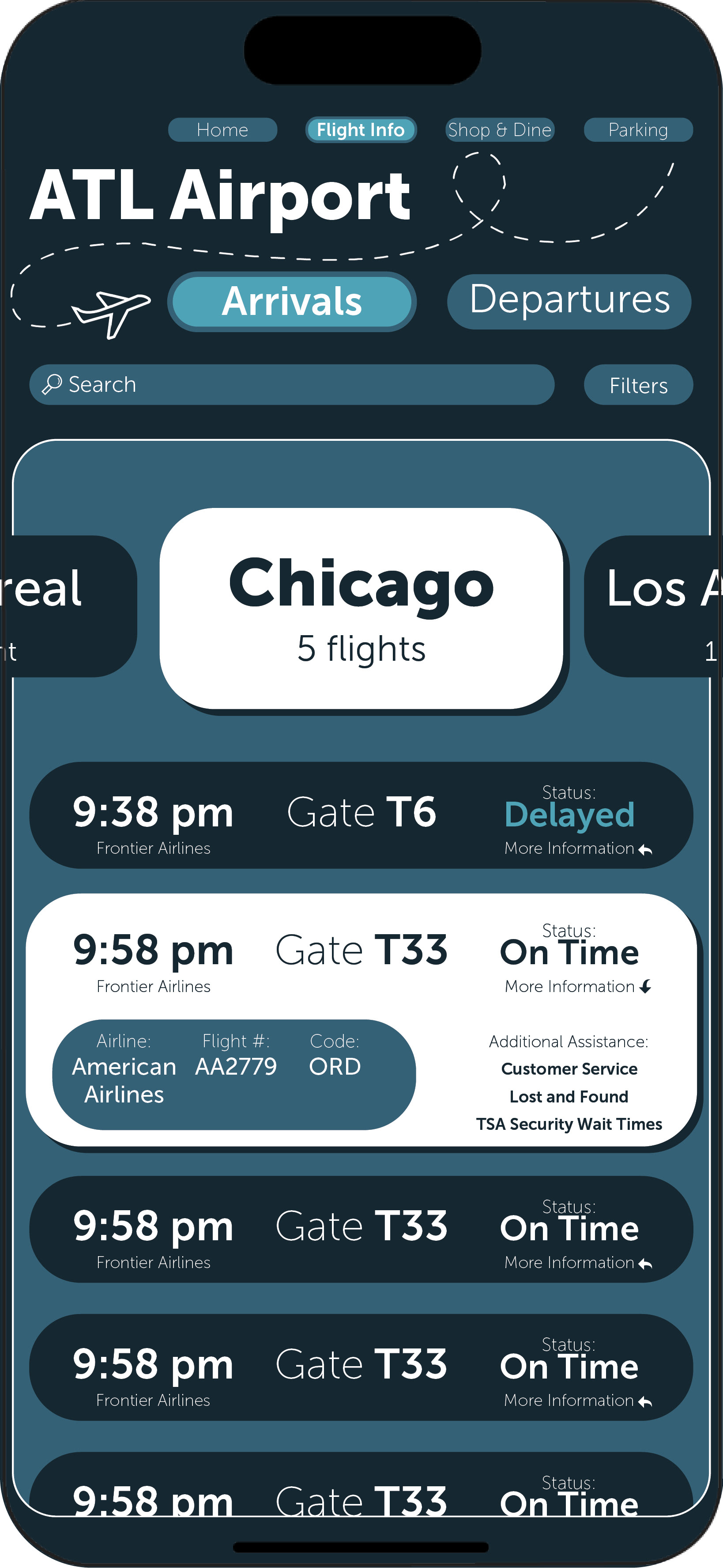
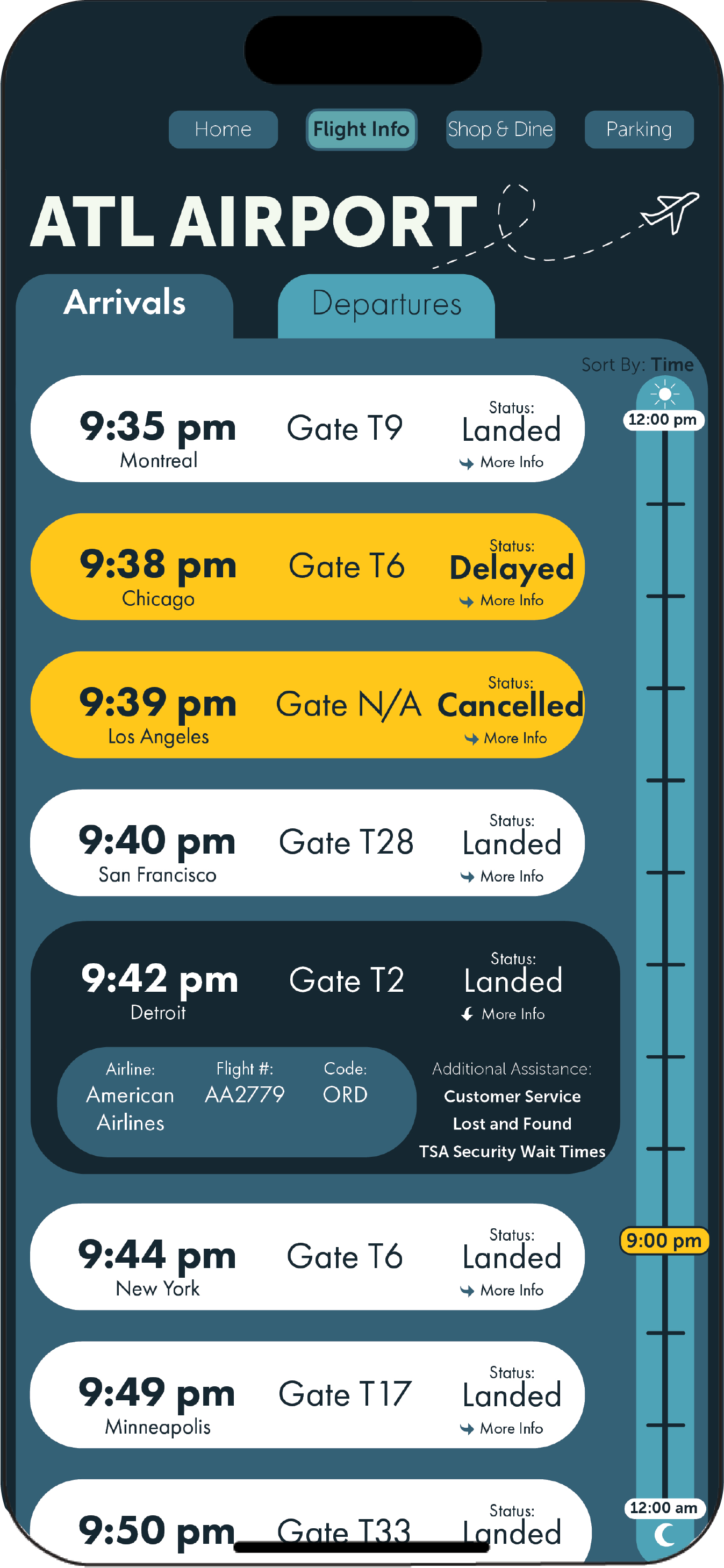
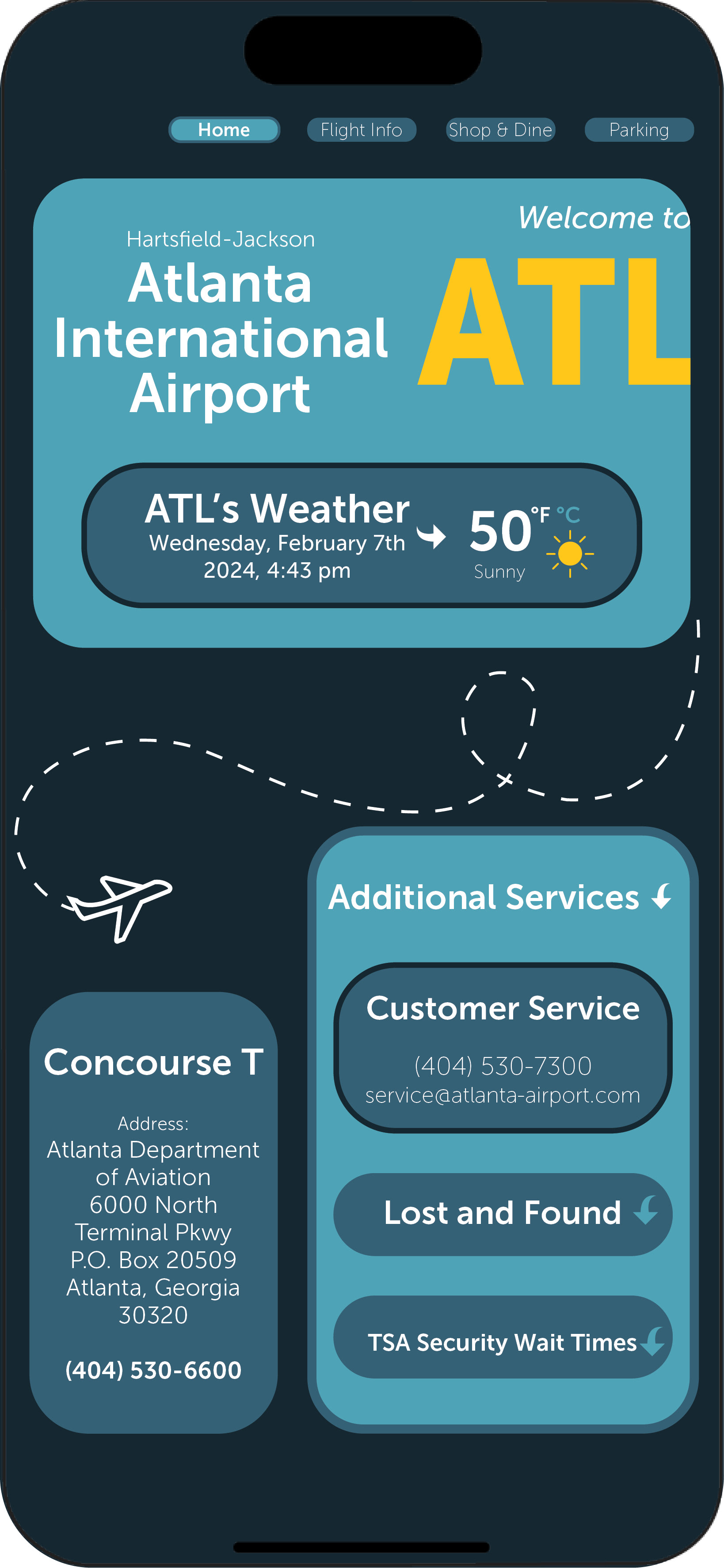
After creating the initial interface mockup, I made updates that improved its intuitiveness, but in doing so, the design became more compact and less reflective of ATL’s identity.
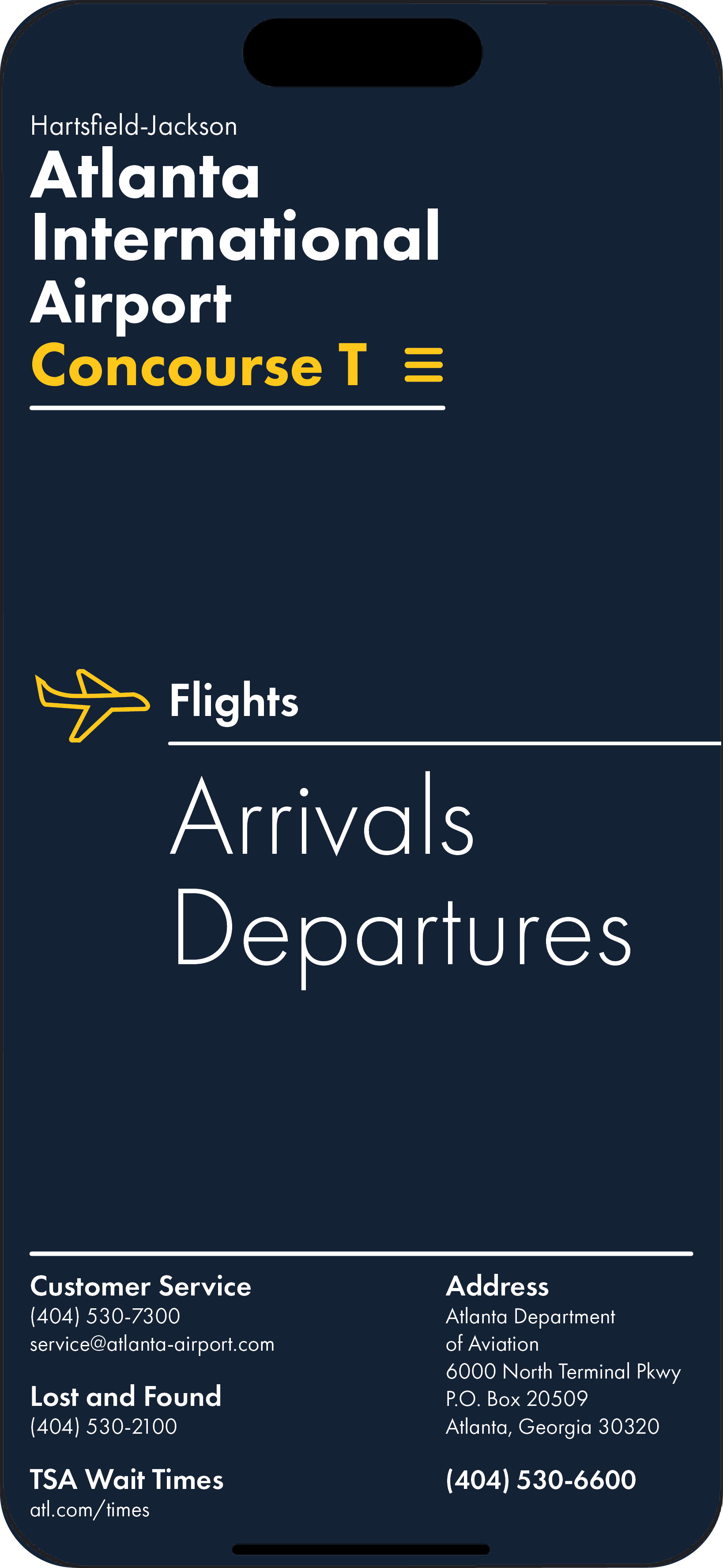
Homepage: Iteration #1
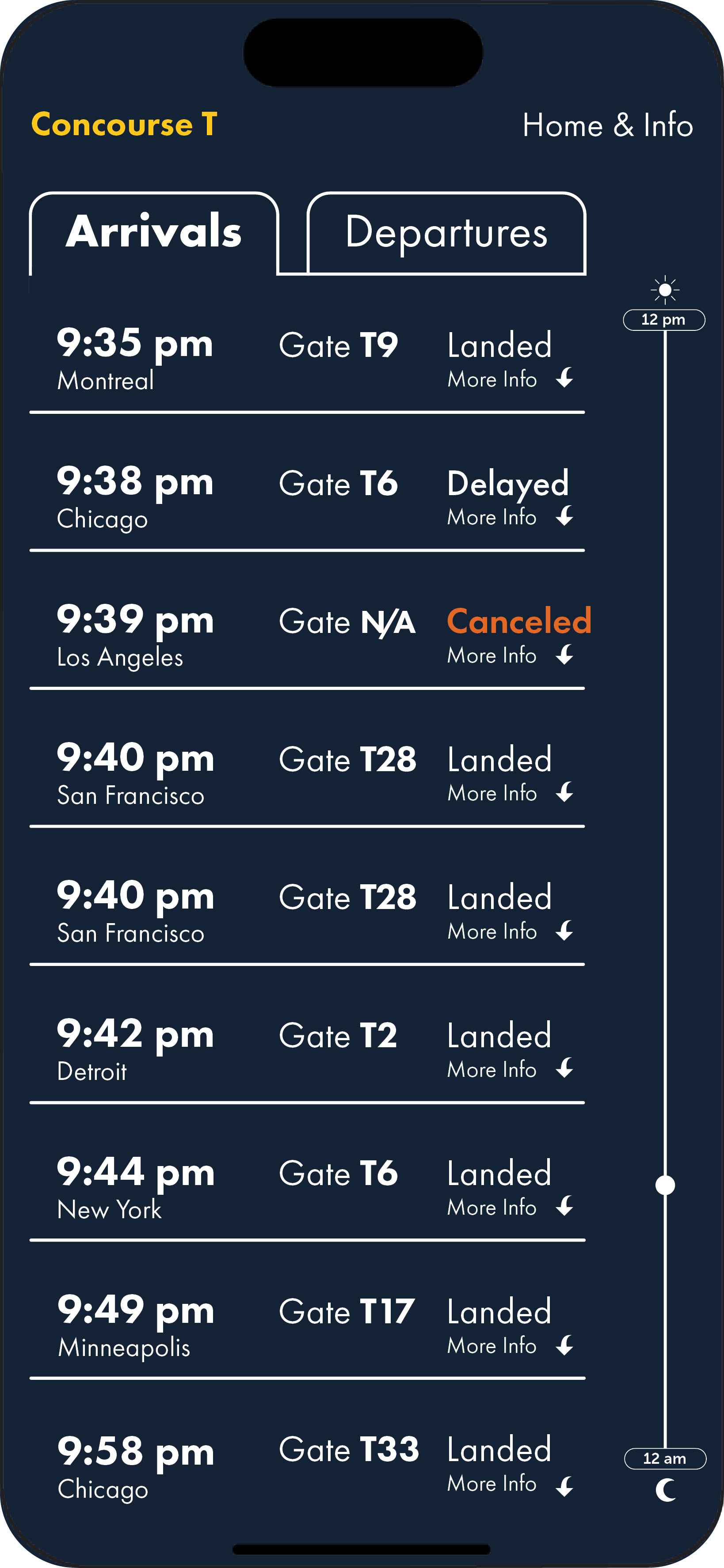
Arrivals Page: Iteration #1
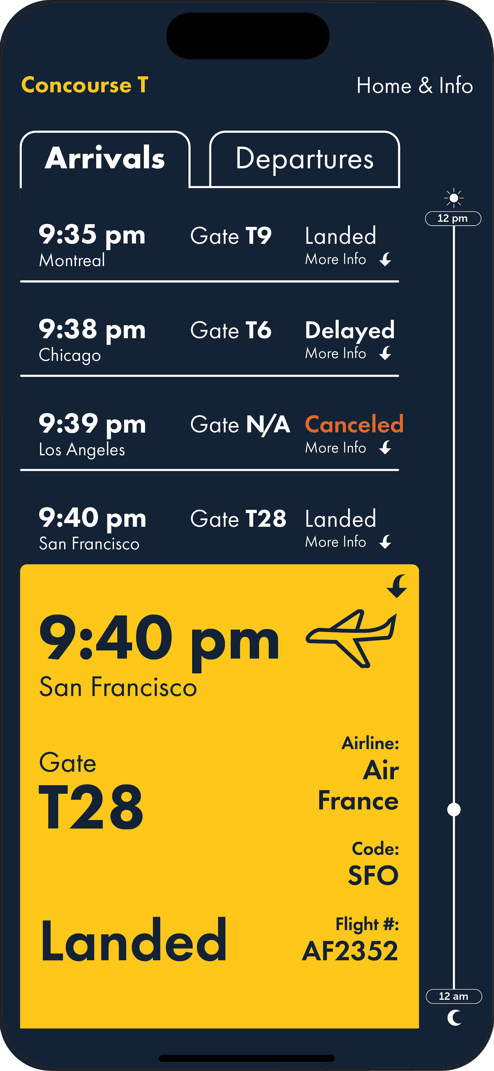

Final Iterations
The refined iteration features a streamlined hierarchy, accessibility language modification, and adjusted color harmony to evoke tranquility, resulting in a design that is both more intuitive and reliable for the end user.
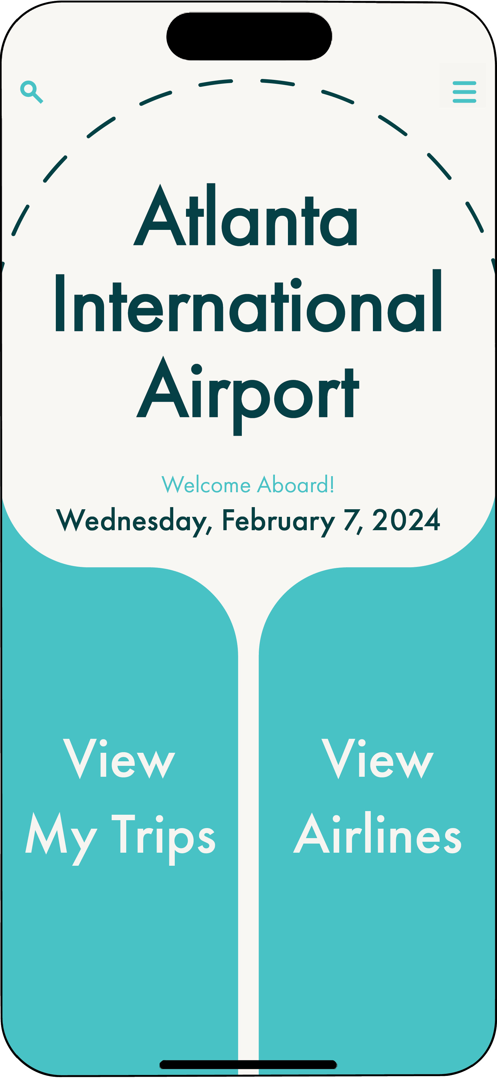
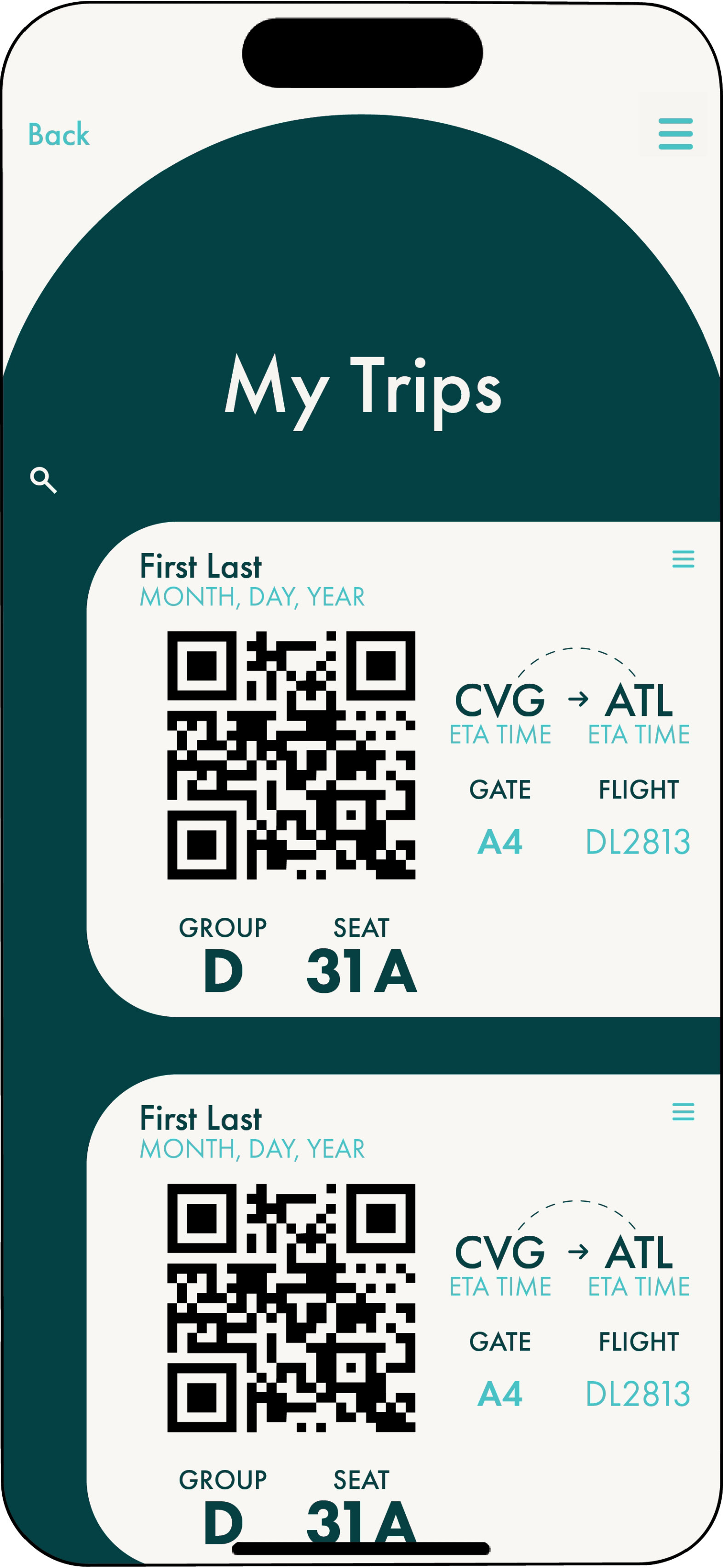

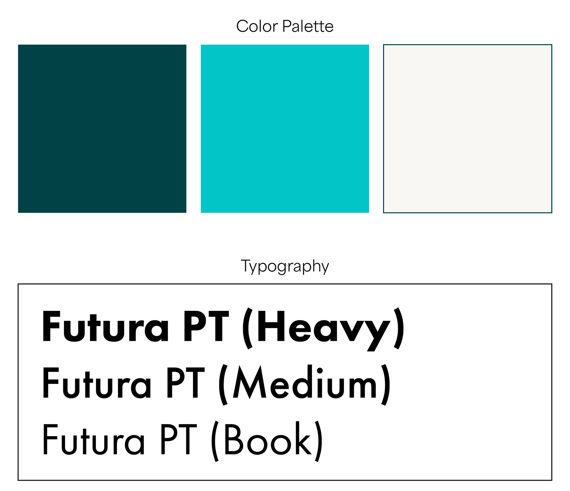
Accessibility Language Modification
Final Composition
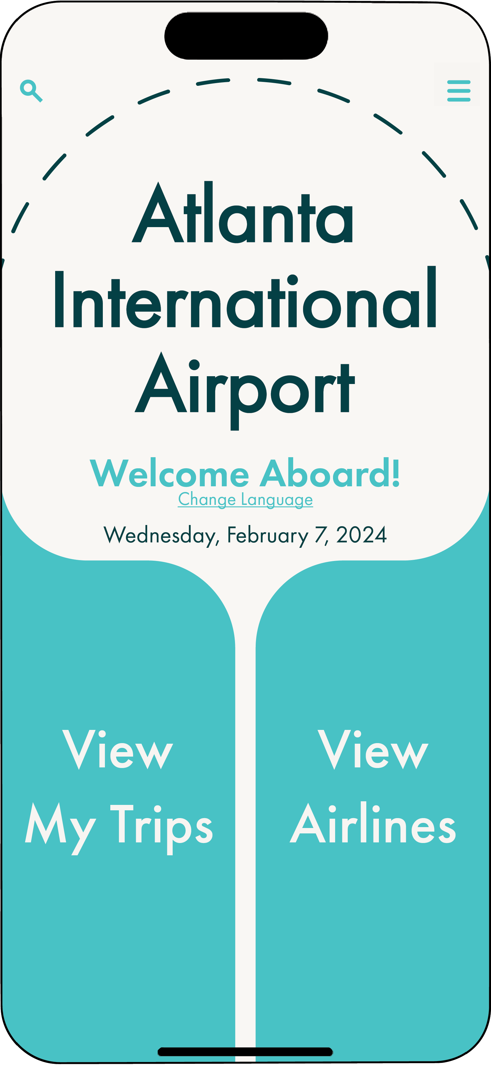
ATL Homepage
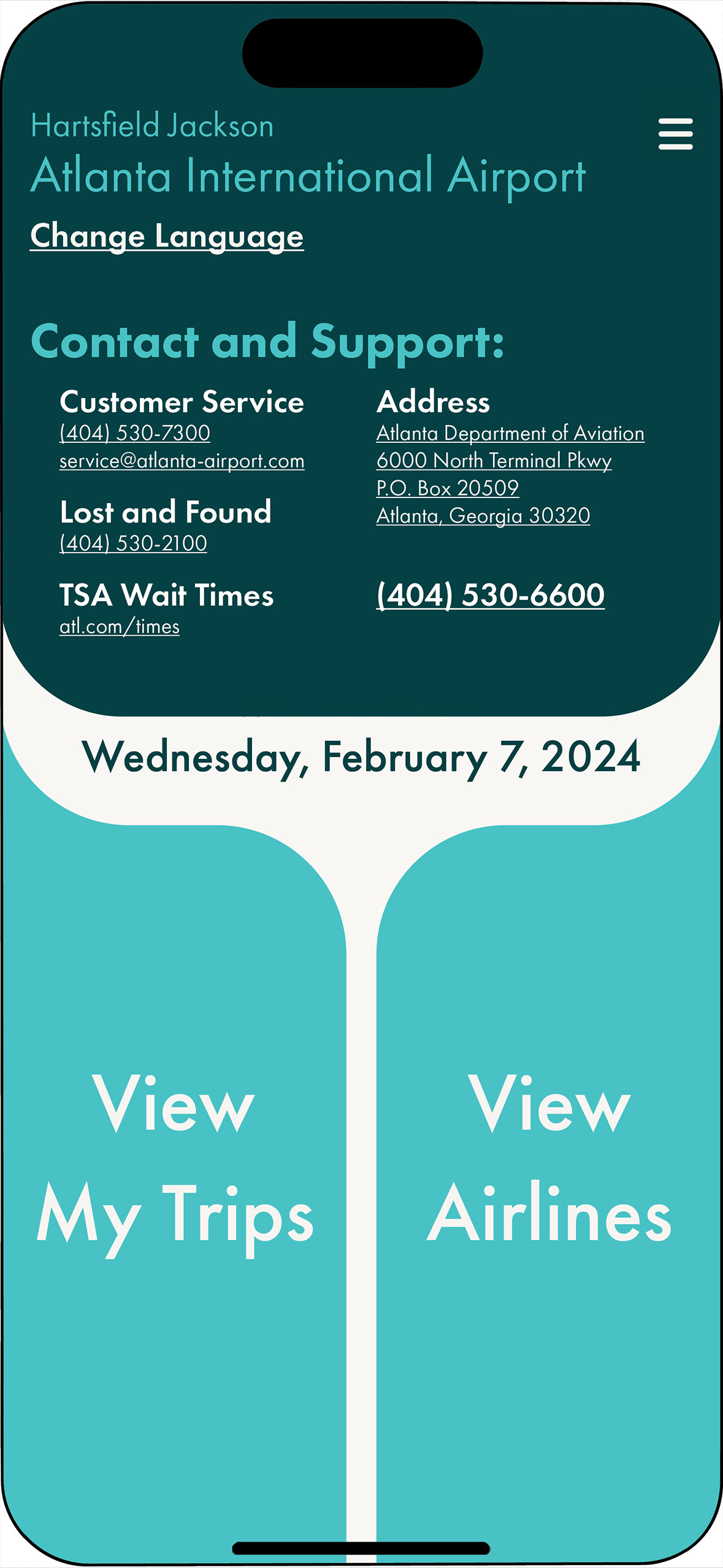
Contact and Support Drop-down

My Trips Page
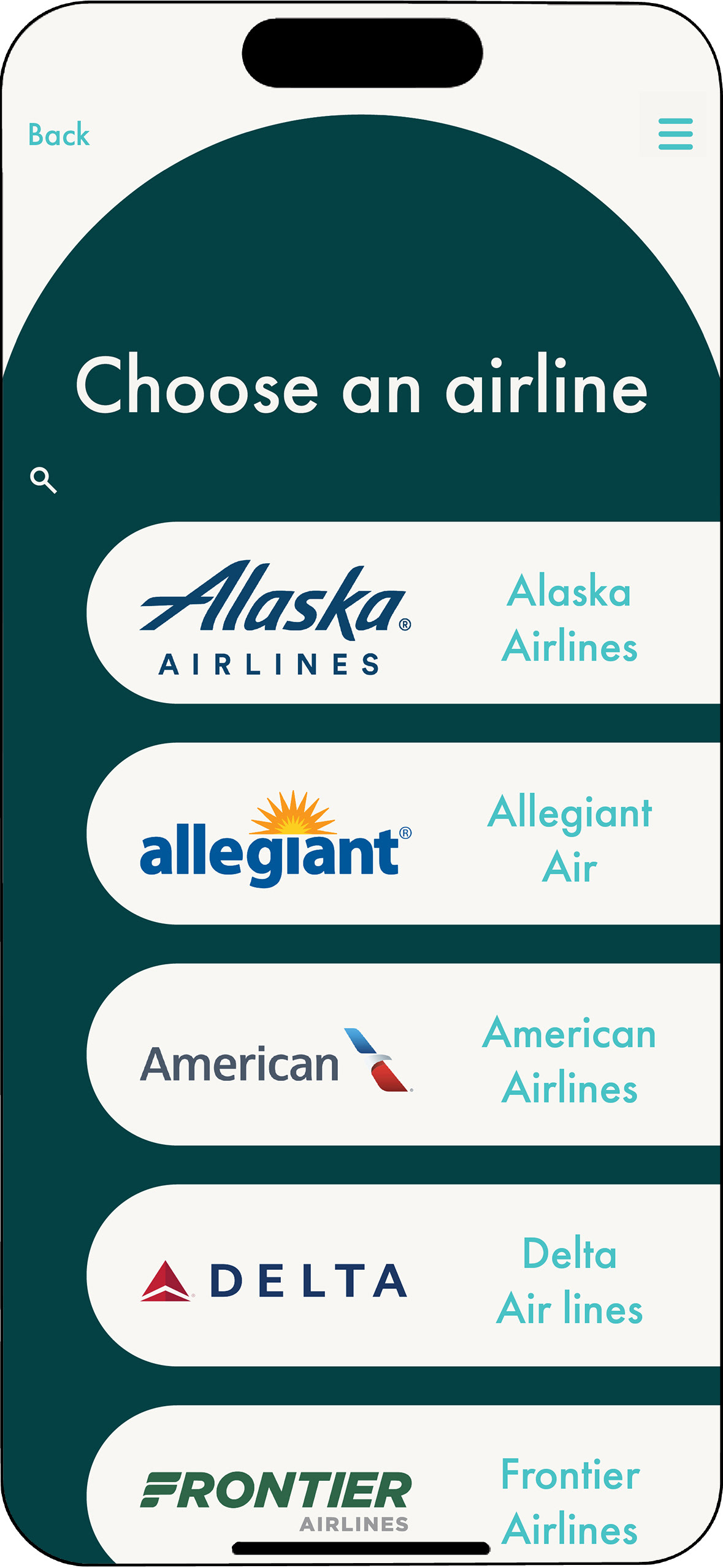
Airline Selection Page
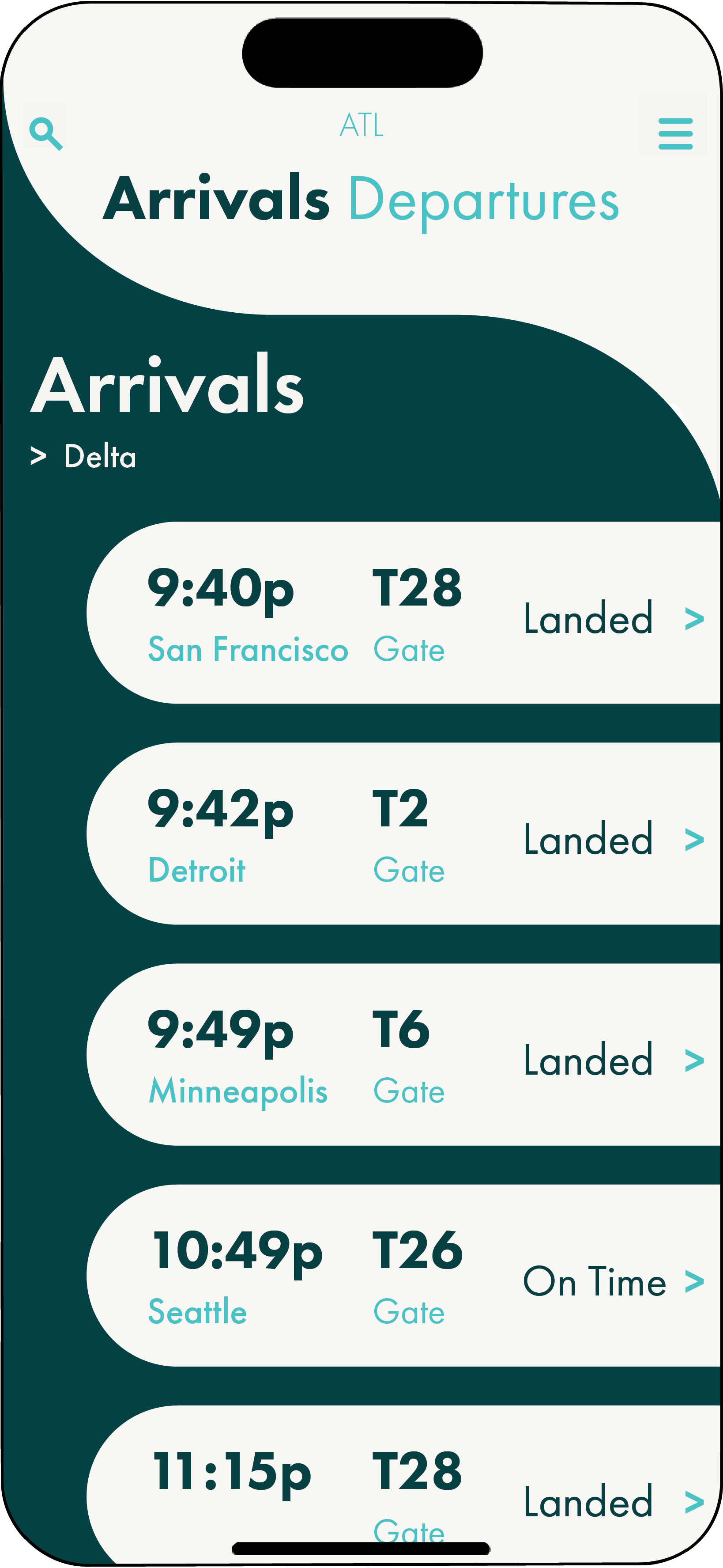
Arrivals Selection Page
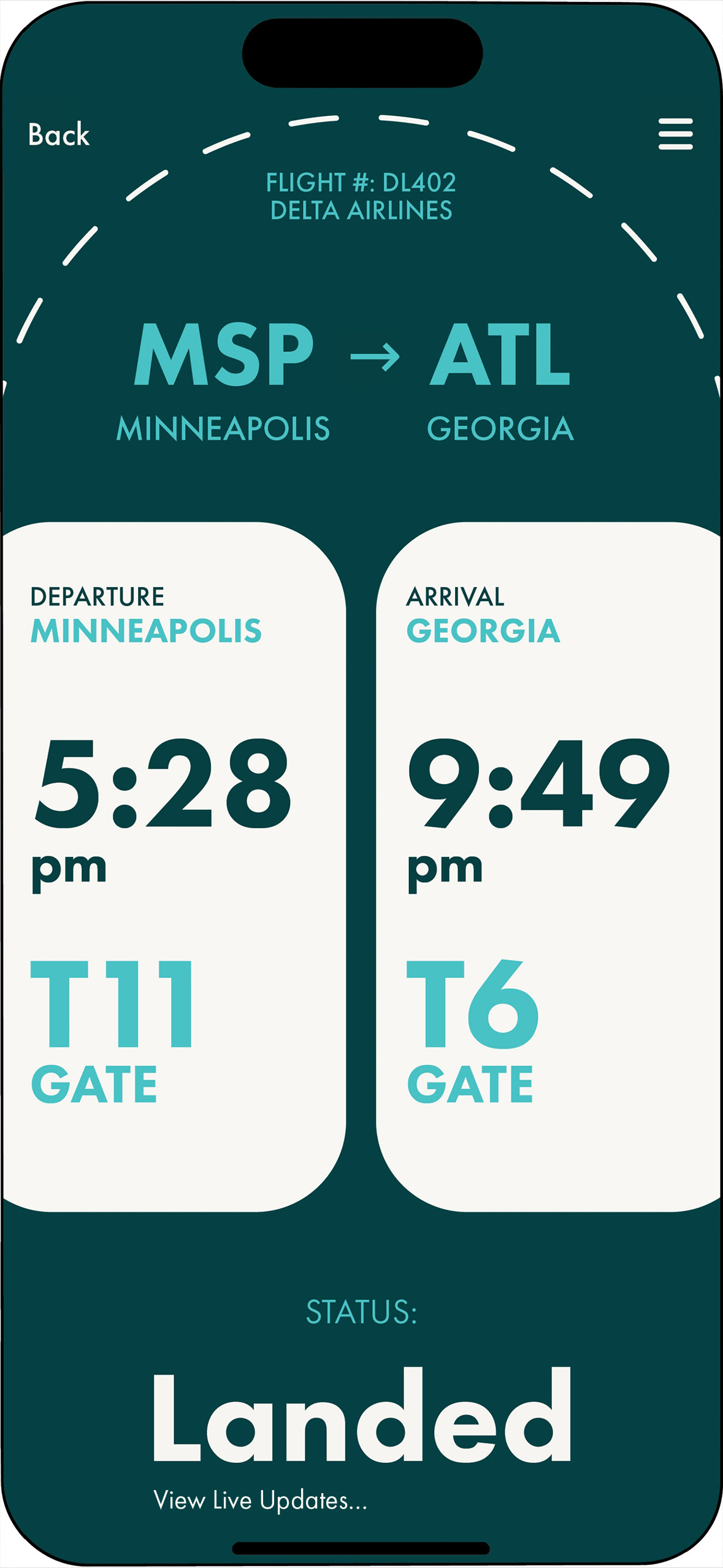
Selected Ticket Page
Adobe XD Prototype


